LinkedIn Dribbble Instagram
← All works
✱ Mobile · Social Case Study Dec 2025 – Mar 2026

DropStories

Instantly convert links into shareable Instagram Stories - paste, pick a template, post.

DropStories cover
Role
Product Designer (End-to-end)
Timeline
Dec 2025 – Mar 2026
Tools
Figma · Material 3 · RevenueCat
Platform
Android
Overview

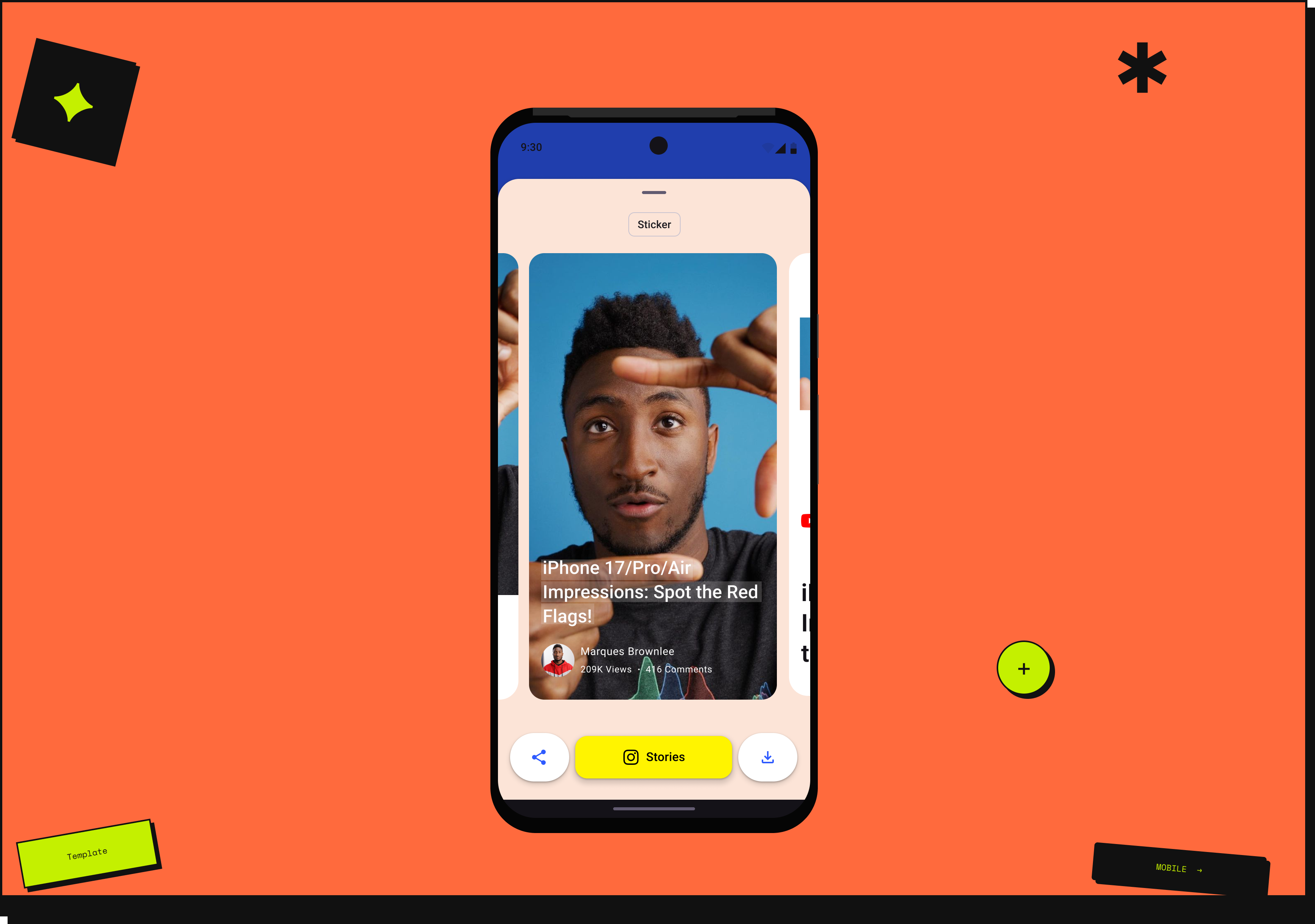
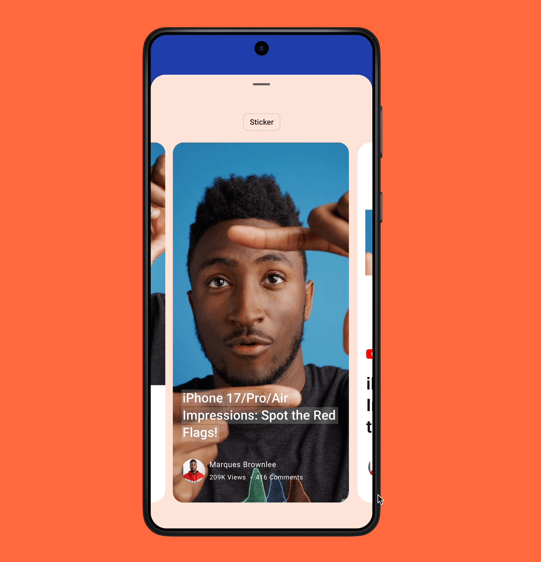
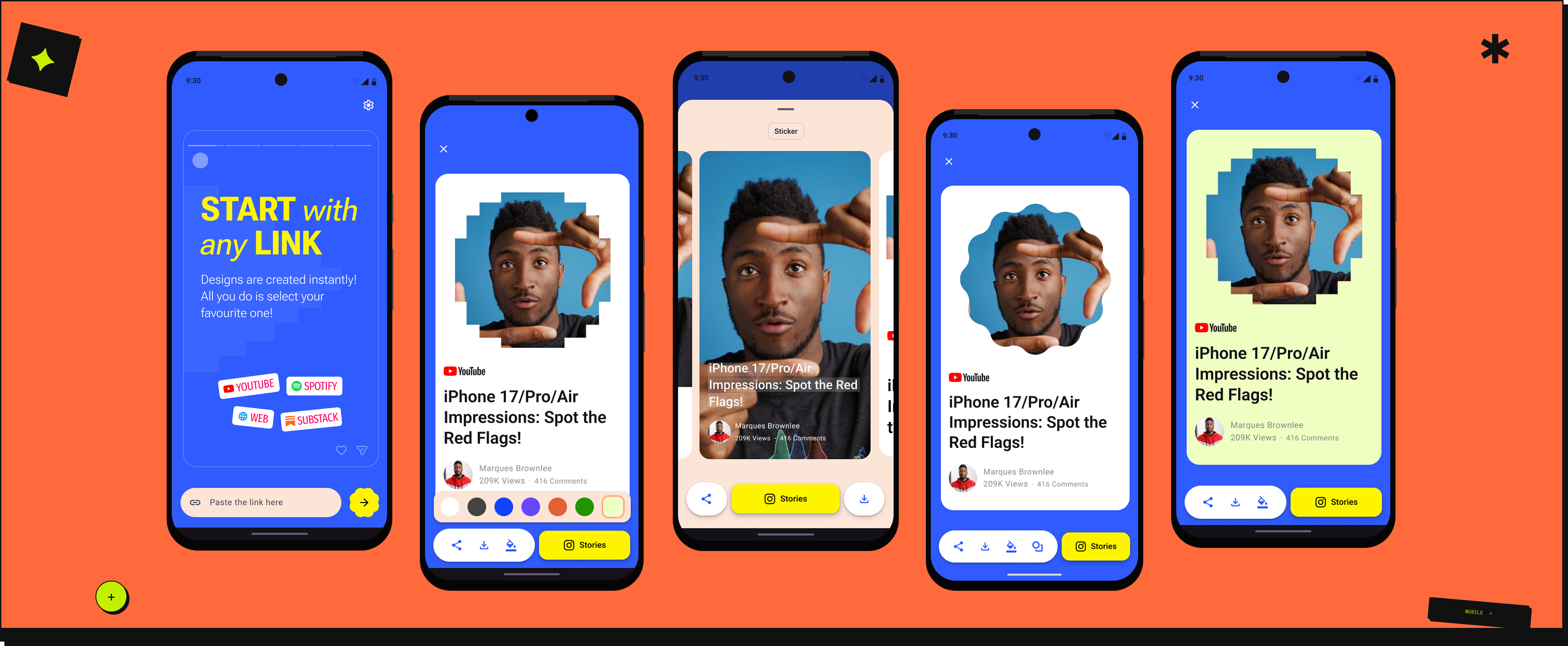
In collaboration with an indie developer, we conceptualized DropStories - an Android app designed to help users instantly convert links into shareable Instagram Stories. Users paste links from YouTube, Spotify, the web, or Substack, and the app transforms them into visually engaging designs for quick sharing.

Unlike my B2B work, this was a different kind of challenge. No PM, no research team, no brief. Just a problem worth solving and the full design responsibility on me.

Constraints we worked within

A real brief,
a real deadline.

This project ran alongside something bigger - I was on maternity leave. Having a real design problem to solve kept the work sharp and the scope intentional. The goal was simple: finish before the leave ended.

  • Colour and shape customisation were stripped for the first release - not enough time to build them properly, and shipping something focused was more valuable than shipping something incomplete. Both are planned for the next version.
  • Android only, deliberately - ToStories already had iOS covered. The gap was on Android, and that's where the opportunity was.
  • Scope was locked to one job from the start - link to story generation, nothing else. Video editing, collage, filters - all out. A tool that does one thing well is more useful to a creator in a hurry than one that does everything poorly.
Research & Discovery

What already
existed.

Before designing anything, we looked at what already existed. ToStories was the closest reference point - not a competitor, but a useful conversation. A friendly discussion with their team surfaced what users were asking for and where the gaps were.

The insight was clear: existing apps were trying to do too much. Video editing, collage, filters, multiple formats - and all of it on iOS. Android users who needed a simple, focused tool for turning links into stories had nothing built for them.

That became the brief. One job, one platform, done well.

The Problem

Understanding
the challenge.

Instagram Stories are widely used for sharing content and recommendations, yet converting external links into engaging stories remains a challenge.

Users who want to share links from other platforms often end up using multiple apps, resulting in an inefficient, fragmented workflow.

For YouTube creators, writers, and independent Spotify artists, sharing in the moment isn't optional - it's how they grow. A fragmented workflow doesn't just slow them down. It costs them the moment entirely.

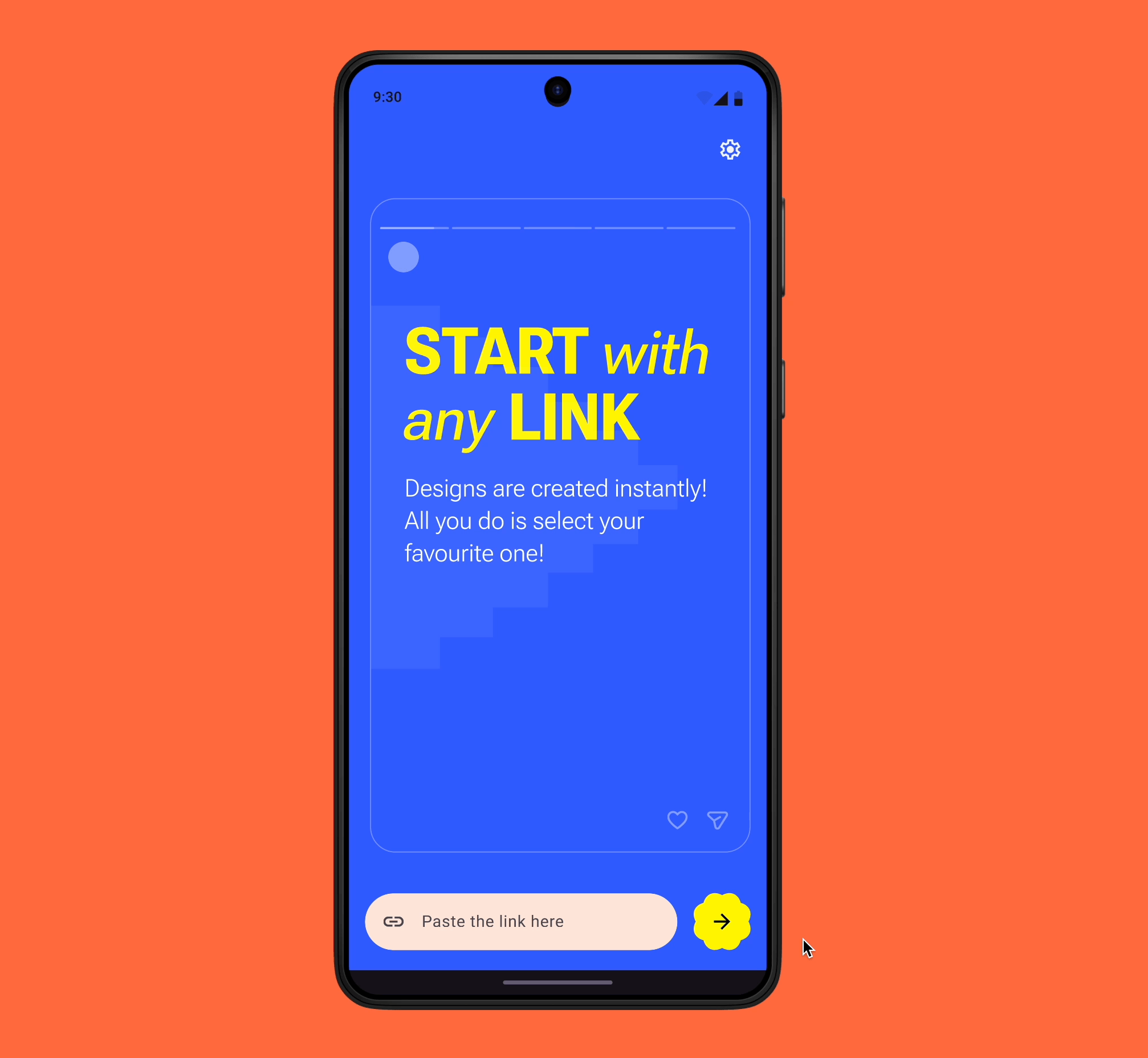
Users needed a single-step solution - paste a link, get a beautiful story, share it instantly.

Design Direction

Why Material 3 Expressive?

M3 Expressive is backed by extensive UX research and helps create interfaces that are more usable and engaging for users.

🎨
Bold Visual Hierarchy
Bold colors and clear hierarchy guide user attention and make important actions easier to find.
Meaningful Motion
Motion enables faster and more confident interaction - every animation has purpose.
🧠
Lower Cognitive Load
Visual consistency strengthens emotional connection, helping users feel comfortable while reducing friction.
M3 Expressive system

Image Source: https://m3.material.io/

Design · 01

Home Screen

  • The home screen provides a subtle onboarding experience inspired by the Instagram Story template - showing users exactly what they can do and which app links are supported, without a single word of instruction.
  • Roboto Flex, a Material 3-inspired variable font, creates clear visual hierarchy through flexible weights and sizes.
  • Bold colors highlight key actions and guide attention, helping users make quick decisions with minimal cognitive load.
  • A shimmering card effect activates when the user rotates their device - a small moment of delight tied to a natural gesture.
Home screen
Design · 02

Templates
Preliminary Design

  • When a user pastes a supported link, templates optimised for Instagram's aspect ratio appear in a bottom sheet - displayed in a horizontally scrollable layout so users can easily browse and choose a design.
  • For the first iteration, the experience was intentionally kept minimal. Only download and share to Instagram options were included, to launch quickly and validate the core flow before adding complexity.

Ship simple. The intermediate state helped validate the core flow before adding complexity.

Templates preliminary design
Design · 03

Templates
Version 2

  • After selecting a template, users can access additional actions - change colors, download, share to other platforms, or instantly share directly to Instagram Stories.
  • Secondary actions are organised in a Material 3 vertical toolbar, keeping them accessible without cluttering the canvas.
  • Sharing to Instagram Stories is the primary action, surfaced through a prominent bold-colored FAB - making the most important thing impossible to miss.
Templates version 2
Design · 04

Interactions

Interactions were designed in line with Material 3 motion principles - meaningful, purposeful, and non-distracting. The shimmering card effect on device rotation is one example of using motion to delight without overwhelming.

Interactions
Pricing

RevenueCat Integration

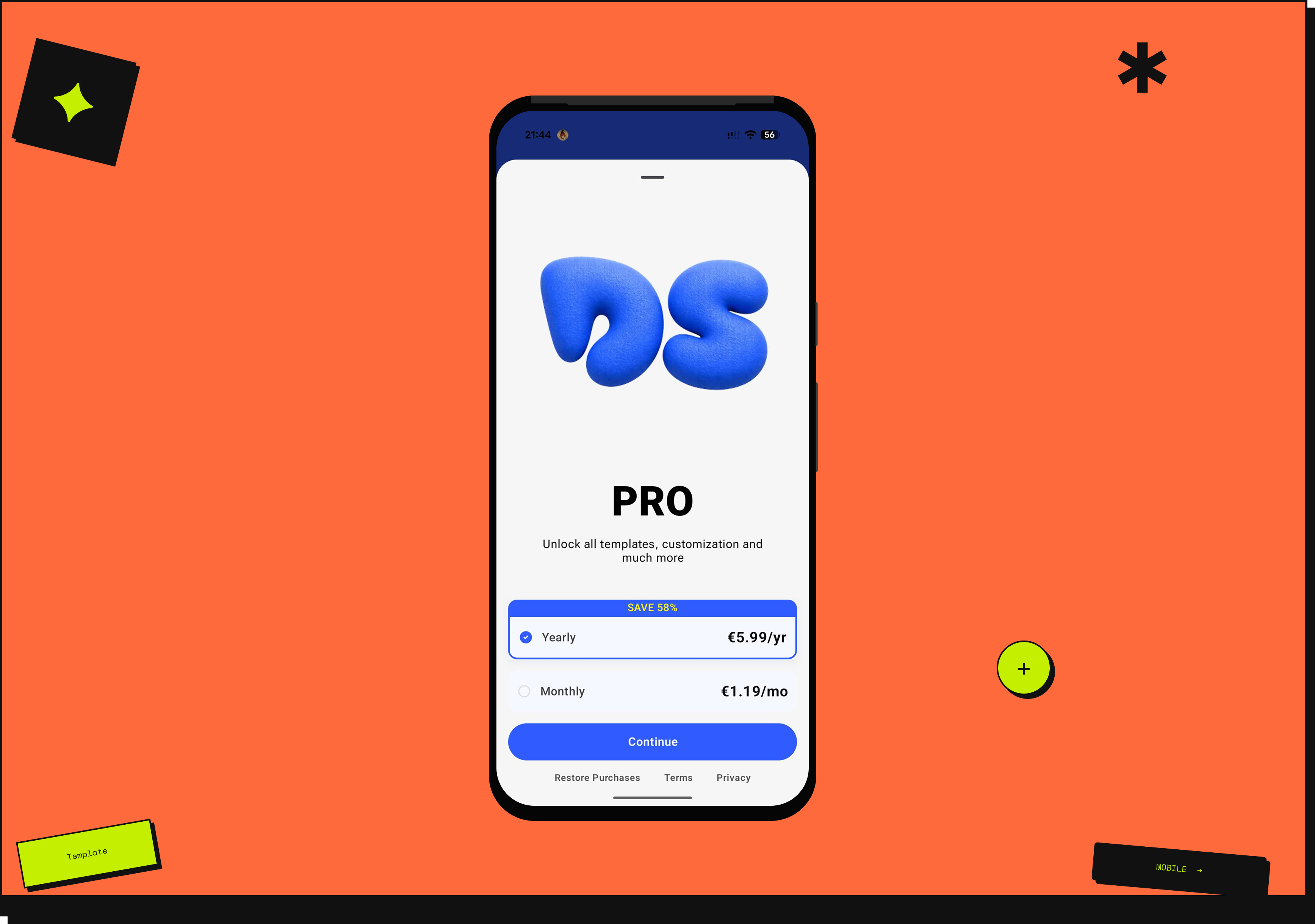
Payments are handled using RevenueCat. The focus was on customising the pricing screen UI to match the product's design system while integrating smoothly with RevenueCat's payment flow - keeping the experience on-brand end to end.

Pricing screen
Next Iteration

Shape Customisation

For the next iteration, a shape customisation option is planned - allowing users to change the image shape within templates using the new Material 3 Expressive shape system.

Future updates animation
Outcome

Tested, shipped,
first paid user.

We tested with a small group of friends and colleagues before launch. No formal sessions, no structured scripts. Just real people using the app and telling us what broke. Most of the feedback was bugs, which is exactly what you want from an MVP test. It meant the core flow was clear enough to use, and the issues were fixable.

DropStories launched in April 2026 with no marketing, no branding push, and no paid acquisition. By May, the app had its first organic paid user. No campaign drove them there. They found it, understood it, and paid for it. For a zero-marketing launch, that is meaningful early validation that the core concept works.

Colour and shape customisation are planned for the next version, giving creators more control over how their stories look and feel.

Key Insights

What I learned.

✂️
A tight deadline is a design tool. Maternity leave gave this project a hard stop - and that constraint made every scoping decision faster and clearer than any formal brief would have.
01
Doing less isn't a weakness - it's a position. The insight from talking to ToStories wasn't about competing, it was about focusing. Stripping everything except one job made the product more useful, not less.
02
🤝
Designing with the developer from the start meant fewer surprises at handoff. RevenueCat, API constraints, Android-specific patterns - knowing the boundaries early shaped better decisions throughout.
03
You're done here
Back to all work →
← All case studies Start a project →