Formelio
Re-designing treatment and procedure tracking for medical professionals - and the design system that powers it all.
.png)
Re-designing treatment and procedure tracking for medical professionals - and the design system that powers it all.
Formelio aims to accomplish the digital transformation that enables safe and standardised medical data exchange, storage and utilisation in health journeys for both healthcare professionals and citizens. My role spanned creating and managing the design system across all product lines, collaborating with stakeholders on new features, establishing design processes, and auditing accessibility.
To respect the NDA with Formelio, the medical business unit has been altered to logistics. Portmelio is a logistics and shipping company used as the representative use case throughout this study.
Portmelio is a logistics and shipping company which aims to disrupt the traditional logistics landscape by providing innovative, customer-centric, and technology-driven solutions.
The existing tracking system had critical gaps that were surfacing through customer feedback and operational overhead.
We collaborated closely with researchers to conduct comprehensive customer interviews on our current design, aimed at gaining insights into the shipment order tracking process. We not only observed the effective aspects but also carefully documented challenges and pain points experienced by users.
To ensure that we did not take this re-design too far, we wanted to draw a boundary. The design brief facilitated an understanding of the project's goals, objectives, and the specific problem to be addressed - helping us focus on the necessary items.
Collaboration with the product team was undertaken to ensure the design brief aligns the project's goals with broader business objectives. This alignment ensures that solutions proposed by the design team contribute to the overall success of the organisation.
A design brief isn't a constraint - it's a compass. It keeps the redesign focused on solving the right problem, not just making things look better.
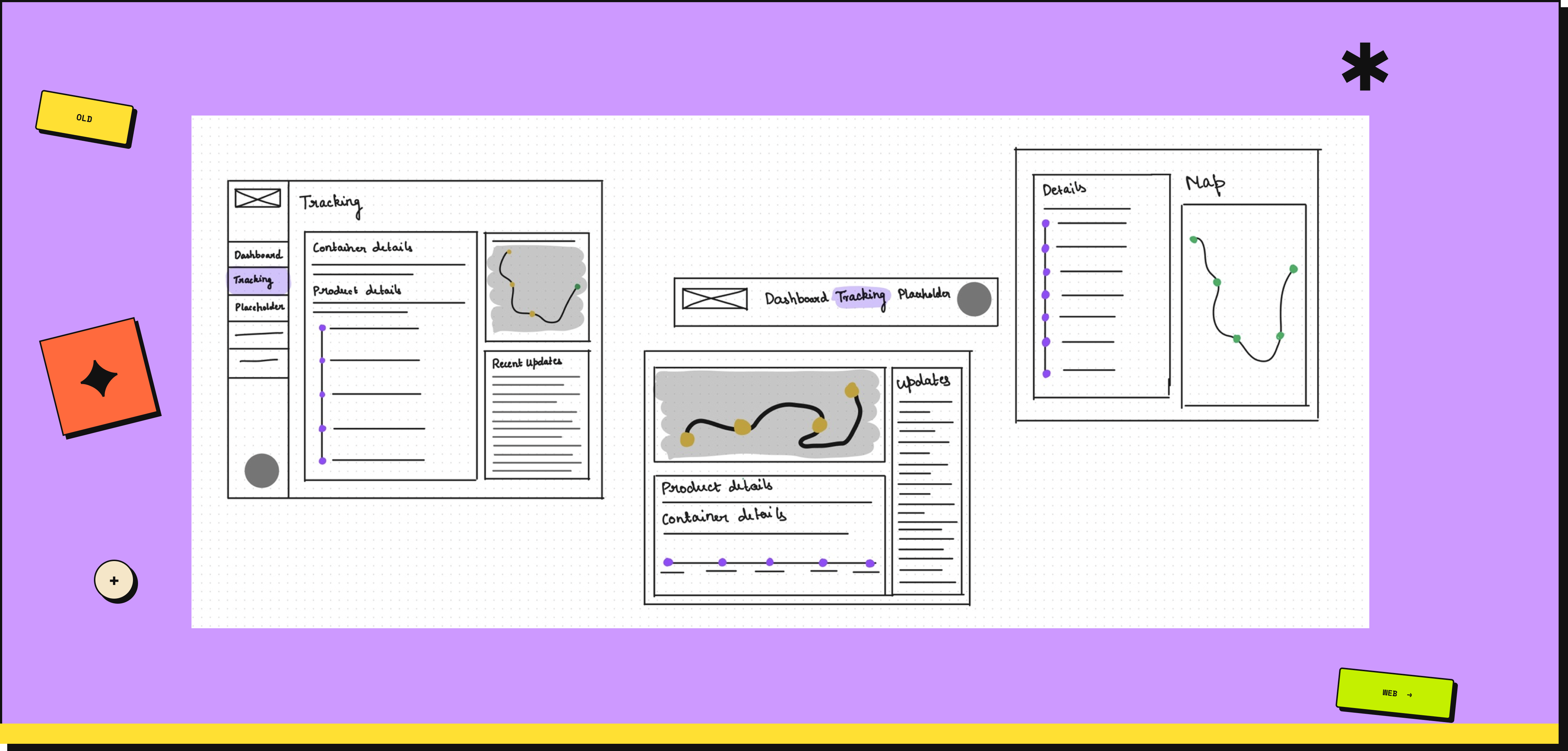
Sketching facilitated the quick generation of various concepts and solutions without significant time investment. Before advancing to the high-fidelity design stage, it was critical to assess the feasibility of implementing the proposed components - ensuring design concepts could be effectively realised within the constraints of the technical infrastructure.
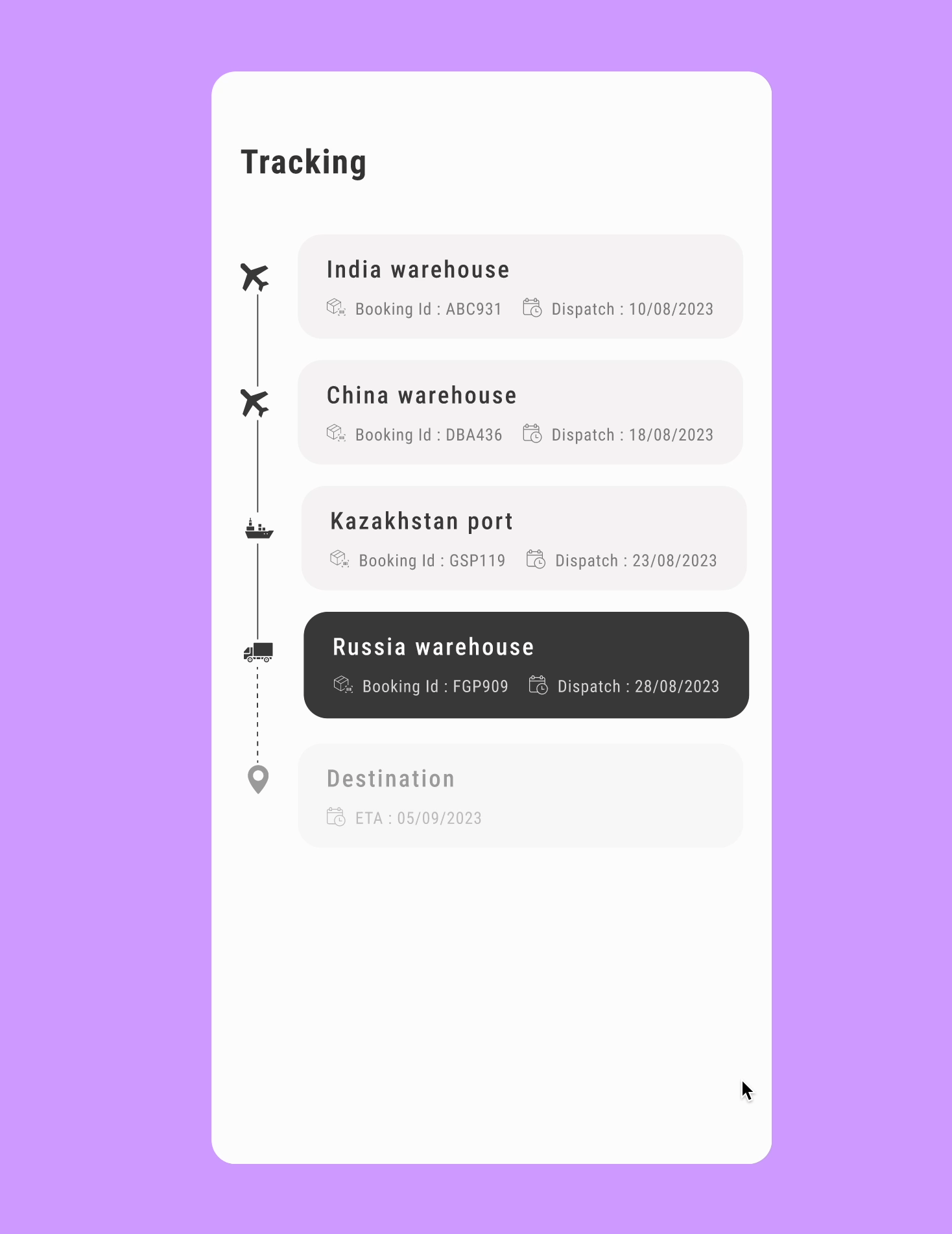
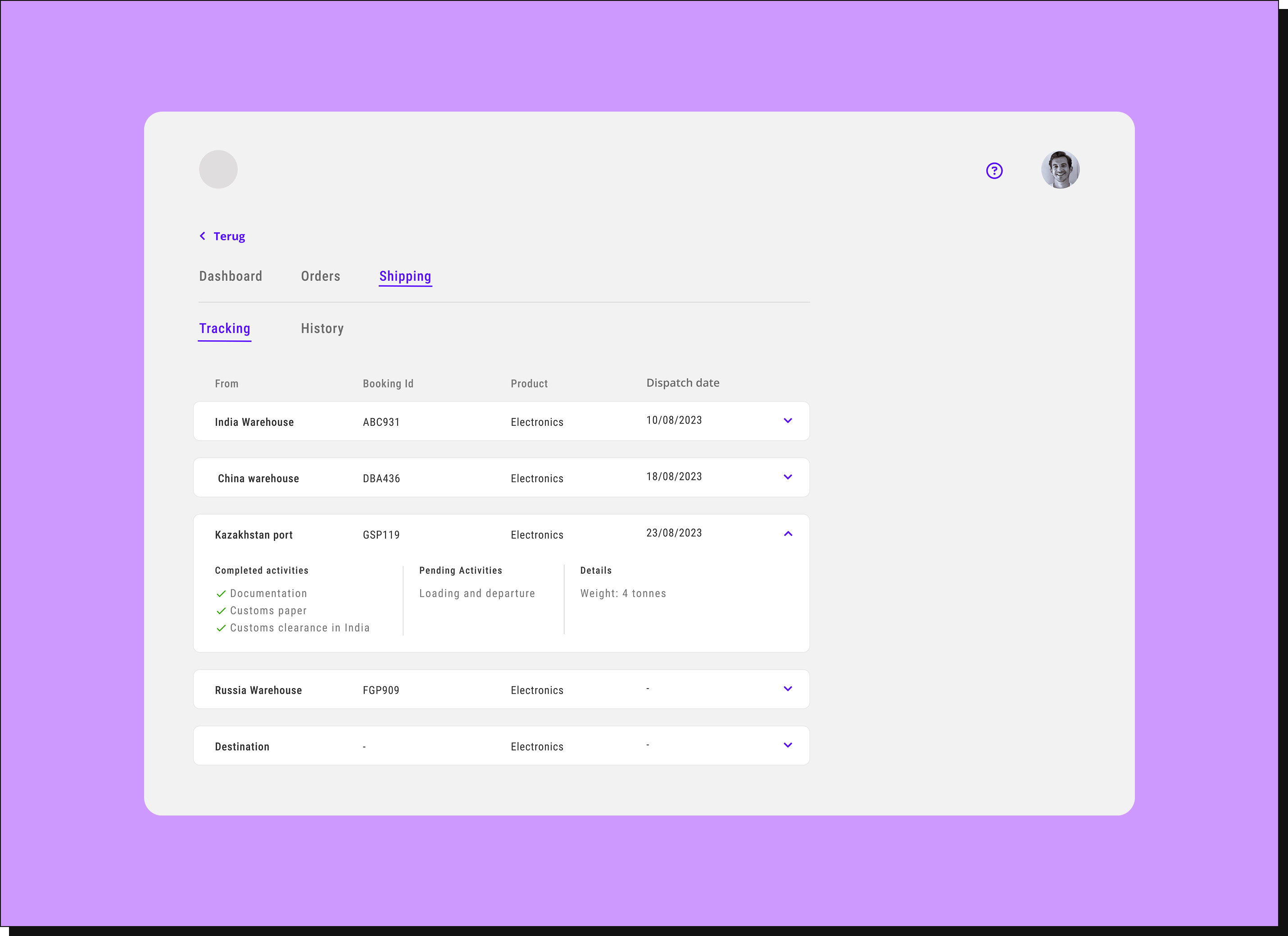
Our earlier design included tracking, but it fell short in communicating event statuses - completed, pending, or currently active. The timeline serves as a natural organiser, presenting events in chronological order. It allows users to intuitively grasp temporal progression, differentiate between events, and access event-specific timing details - all while alleviating the cognitive strain of the previous design.
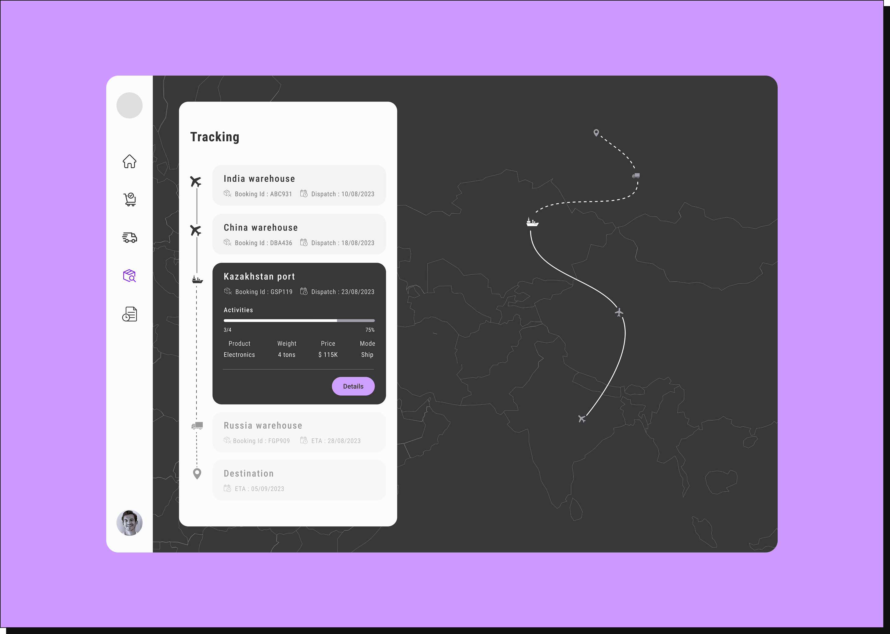
Users expressed frustration with the nested top bar navigation due to its complexity. The nested structure hid critical content and features, making discovery challenging. We switched to a sidebar navigation - always visible on screen, ensuring convenient access to crucial sections. Sidebar navigation can handle a wide range of content, making it adaptable as the application expands.