LinkedIn Dribbble Instagram
← All works
✱ Product Design Case Study Dec 2023 – Present

History
Browser

Redesigning the History Browser for a Cloud-based Video Surveillance System - reducing drop-off and bringing users back.

History Browser - Case Study Cover
Role
UX Designer (End-to-end)
Timeline
Dec 2023 – Present · Eagle Eye Networks
Tools
Figma · FigJam · Confluence · PostHog
Platform
Web App
✱ TL;DR

Users were abandoning the new web app and reverting to the legacy system at a rate of 70%+. The History Browser - the most-used, highest-friction feature - was redesigned end-to-end. After a phased rollout across two releases, adoption hit 99%+. The legacy system is now being retired.

Before redesign
70%drop-off
April - cluster rollout
54%adoption
May - full rollout
99%+adoption
See full results ↓
Overview

A cloud-based smart video surveillance platform that allows users to manage their business anywhere, anytime, on any device - loaded with AI-based analytics and media operations, serving multiple industries around the world.

The project involved close collaboration across design, product, and engineering - working with a PM, Head of Engineering, Sr. Director of UX/UI, and Director of Product Management, with an engineering team executing the build. I led design end-to-end.

The Problem

Understanding
the challenge.

As part of modernising the platform, a new web application replaced a legacy system that users had relied on for many years. The new app was built with improved performance, a scalable architecture, and a refreshed interface - but migration wasn't just a technical shift. It required users to adapt to a new experience after years of habit-building.

Shortly after launch, a concerning pattern emerged: users initially accessed the new web app, but many did not stay. They frequently switched back to the legacy application, resulting in a high drop-off rate - measured through PostHog analytics and NPS feedback.

The legacy system had a planned sunset date - but retirement kept getting pushed back. Until users fully adopted the new app, the old system had to stay alive. Every user reverting was a delay to a deadline the business had already missed.

Design Goal

Enable users to seamlessly transition to the new web app by delivering a History Browser experience that feels intuitive, efficient, and reliable - reducing fallback to the legacy system.

User Feedback

Issues described
by users.

The issue was not tied to a single broken feature, but to a broader mismatch between user expectations and the new design experience.

  • Less intuitive than what they were used to - key actions were less discoverable, and familiar interaction patterns were changed, forcing users to pause and think instead of acting from habit.
  • Harder to navigate during time-sensitive tasks - important controls like zoom, playback, and event navigation were harder to access or required more steps.
  • Missing the efficiency they had built muscle memory around - workflows that were previously quick and predictable now required more effort and relearning.

The new system required users to relearn workflows they had already mastered.

Strategic Focus

Why the History
Browser specifically?

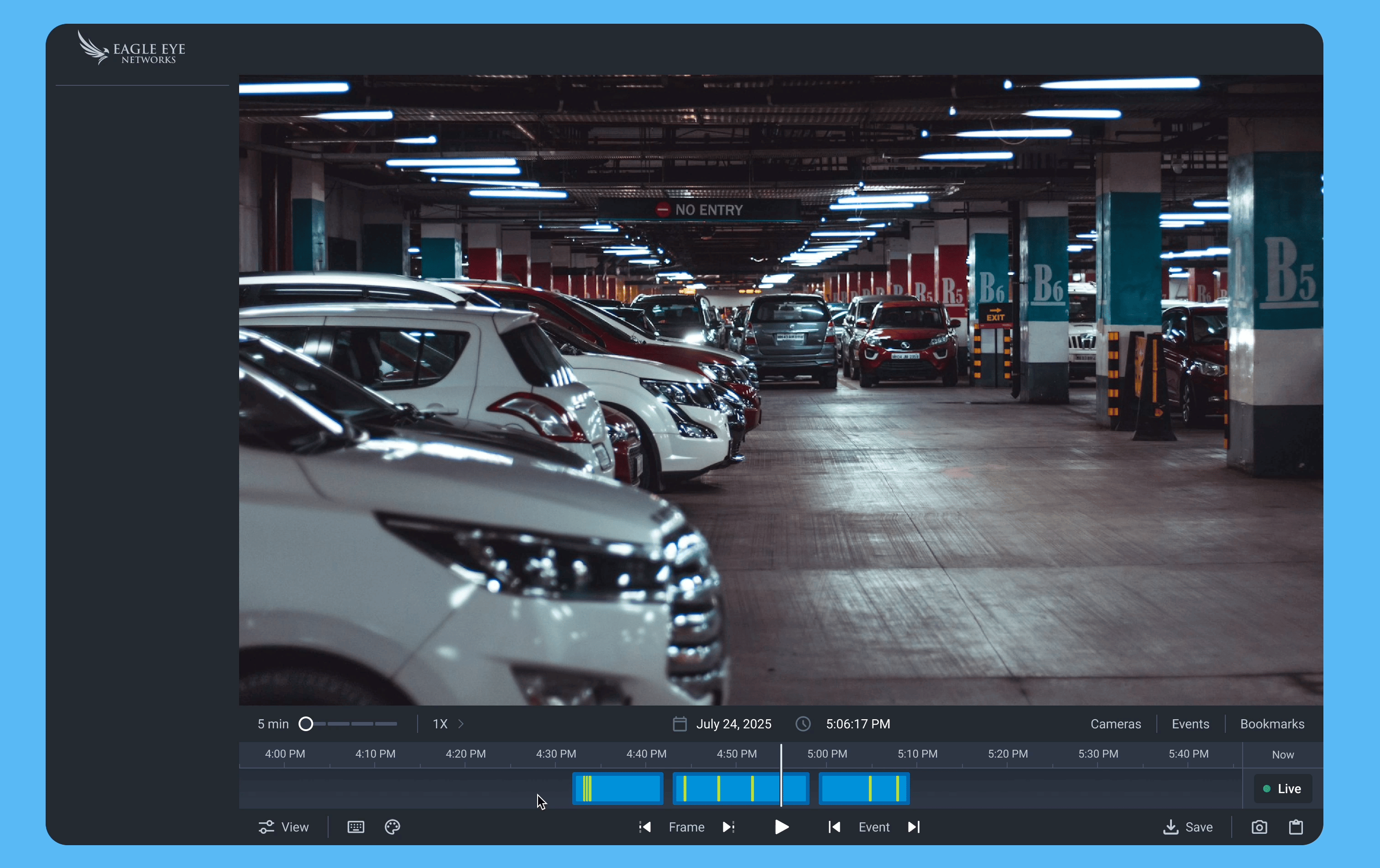
Although the problem was systemic, one feature consistently surfaced in both usage data and feedback: the History Browser. It was one of the most frequently used and workflow-critical features in the entire product.

  • Users relied on it daily to investigate past events, navigate through recorded timelines, and validate incidents quickly.
  • Any friction in this area had a disproportionate impact on overall experience.
  • It became a key decision point - the moment users chose whether to stay in the new app or return to the old one.
1 Opportunities & Scope

Identifying
Opportunities

We began by collaborating closely with the product team, business stakeholders, and incorporating user insights from our user summit. The system was feature-rich and complex - without clearly defining boundaries, the redesign risked becoming a large, unfocused effort with difficult engineering dependencies.

  • Identified the most critical user workflows by analysing PostHog usage data and user feedback.
  • Prioritised high-impact areas within the History Browser to focus design effort where it mattered most.
  • Aligned with engineering on technical feasibility and API constraints early, ensuring proposed solutions were scalable and implementable.
  • Defined a clear, realistic scope to maintain focus on high-impact improvements while balancing user needs with technical constraints.
Constraints we worked with

An open brief is
its own challenge.

An open brief sounds like creative freedom. In practice, it meant the design work started one step earlier - before a single screen was touched, the problem itself had to be defined.

  • No requirements, no scope, no success criteria - just a directive to improve.
  • Deciding what to improve and why was the first deliverable.
  • The risk of solving the wrong problem was real - early alignment with data and stakeholders kept the work grounded.
  • Narrowing a complex, feature-rich product down to focused, high-impact changes required as much judgment as the design itself.
2 Research

Self &
Competitor Analysis

We conducted a thorough analysis of both our existing solutions and competitor products. A self-assessment compared the History Browser in the new web app with the legacy version, identifying gaps in usability, interaction patterns, and feature accessibility.

In parallel, a competitor analysis helped us understand industry standards and best practices - answering a critical question: why do users still perceive the legacy system as more intuitive, despite the advancements in the new application?

🧠
Learned Behaviour
The legacy system benefited from years of habit and muscle memory that the new app had yet to earn.
🔍
Discoverability Gaps
Critical interactions were less discoverable or required more steps to complete in the new experience.
Missing Efficiency
Speed, clarity, and streamlined navigation - hallmarks of the legacy system - were not fully replicated.
Design Decision

The obvious path
wasn't the right one.

The most obvious path was to replicate what users already knew - rebuild the legacy experience inside the new app and call it done. We deliberately chose not to.

User feedback pointed to familiar patterns and interactions they missed. But familiarity is not the same as good design. The legacy system had its own friction - users had simply learned to work around it. Rebuilding those workarounds into the new app would have solved the wrong problem.

The goal was to make the new experience feel intuitive - not to make it feel old.

Here's how that principle played out across the interface.

3 Design · Timeline

Improving the
Timeline Experience

  • The previous timeline was small in height, with events shown as thin bright green strokes - narrow, hard to see, and difficult to interact with, especially when events overlapped.
  • Increased the height of the timeline to give more vertical space for visibility and interaction.
  • Redesigned event indicators from thin lines into larger, more visible blocks - easier to notice and click.
  • Added subtle borders around each event block to separate overlapping events visually, making it easier to understand simultaneous occurrences at a glance.
Old timeline - thin strokes
Before
Redesigned timeline - event blocks
After
Design · Zoom & Playback

Zoom & Playback
Speed Controls

  • The previous zoom used small + and – icons that many users struggled to find. Replaced with a direct time-range selector - 5 min, 15 min, 30 min, or full day - making zoom immediately obvious.
  • Playback speed was buried inside a menu. Brought it out into the main interface alongside zoom controls so users can adjust both without digging through menus.
  • Added visual feedback: the zoom section highlights when adjusted, and the speed control becomes active when changed - making interactions feel more responsive and easier to understand.

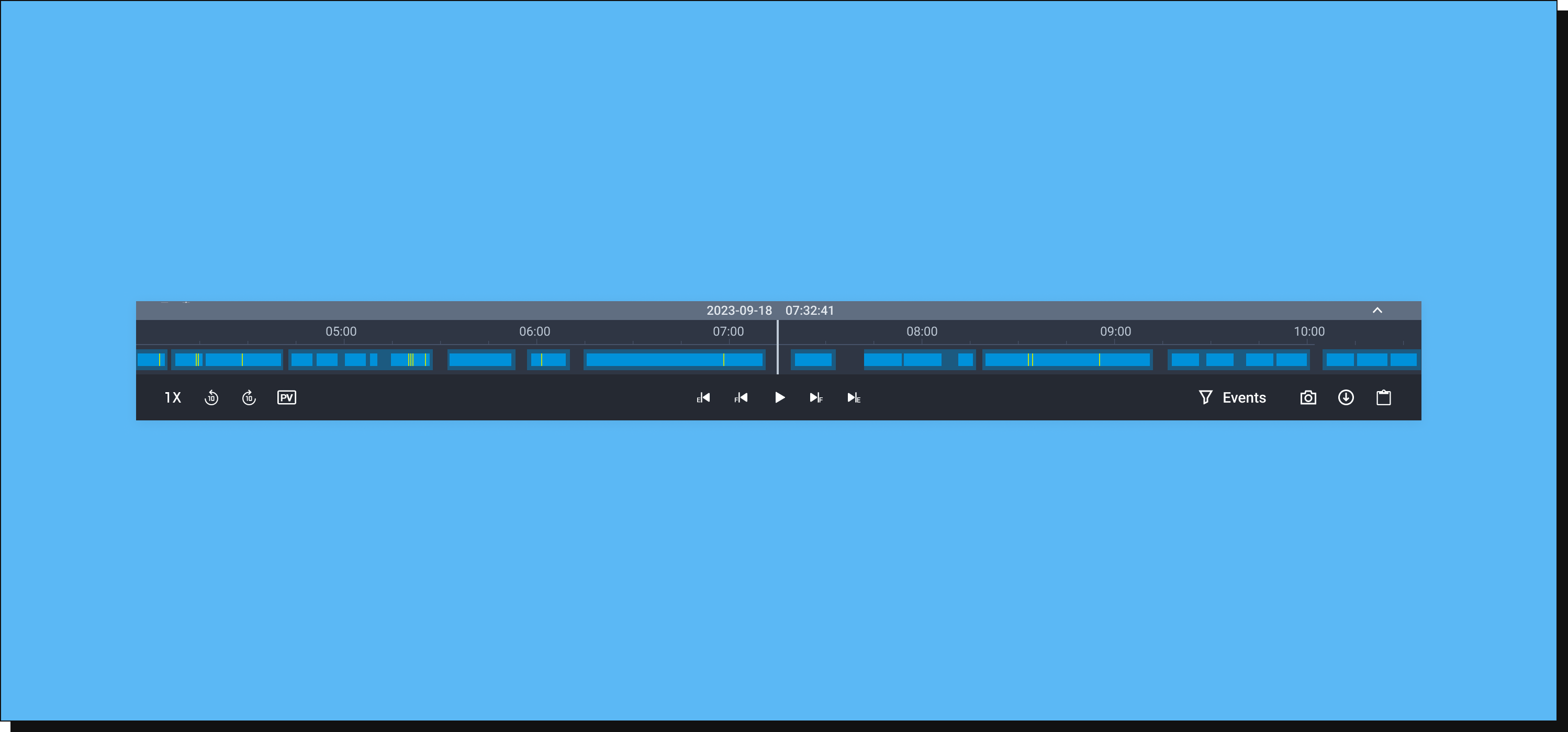
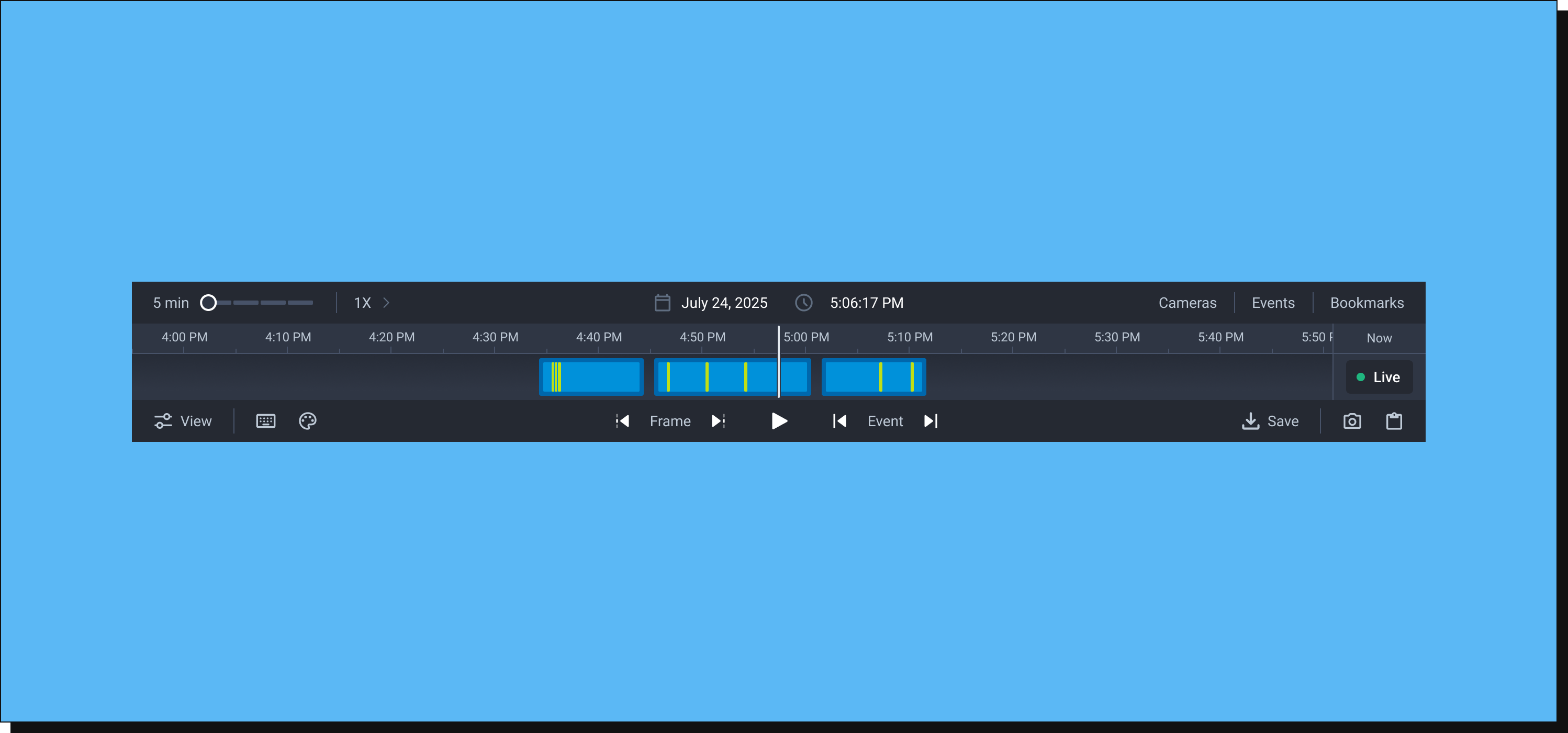
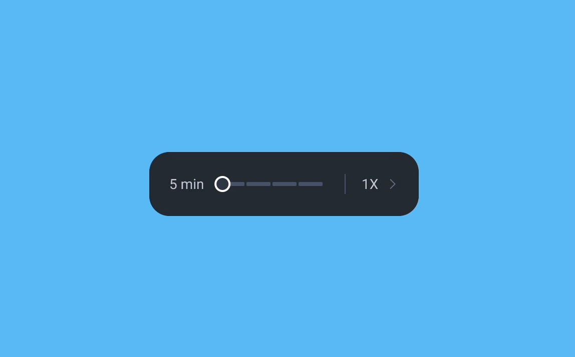
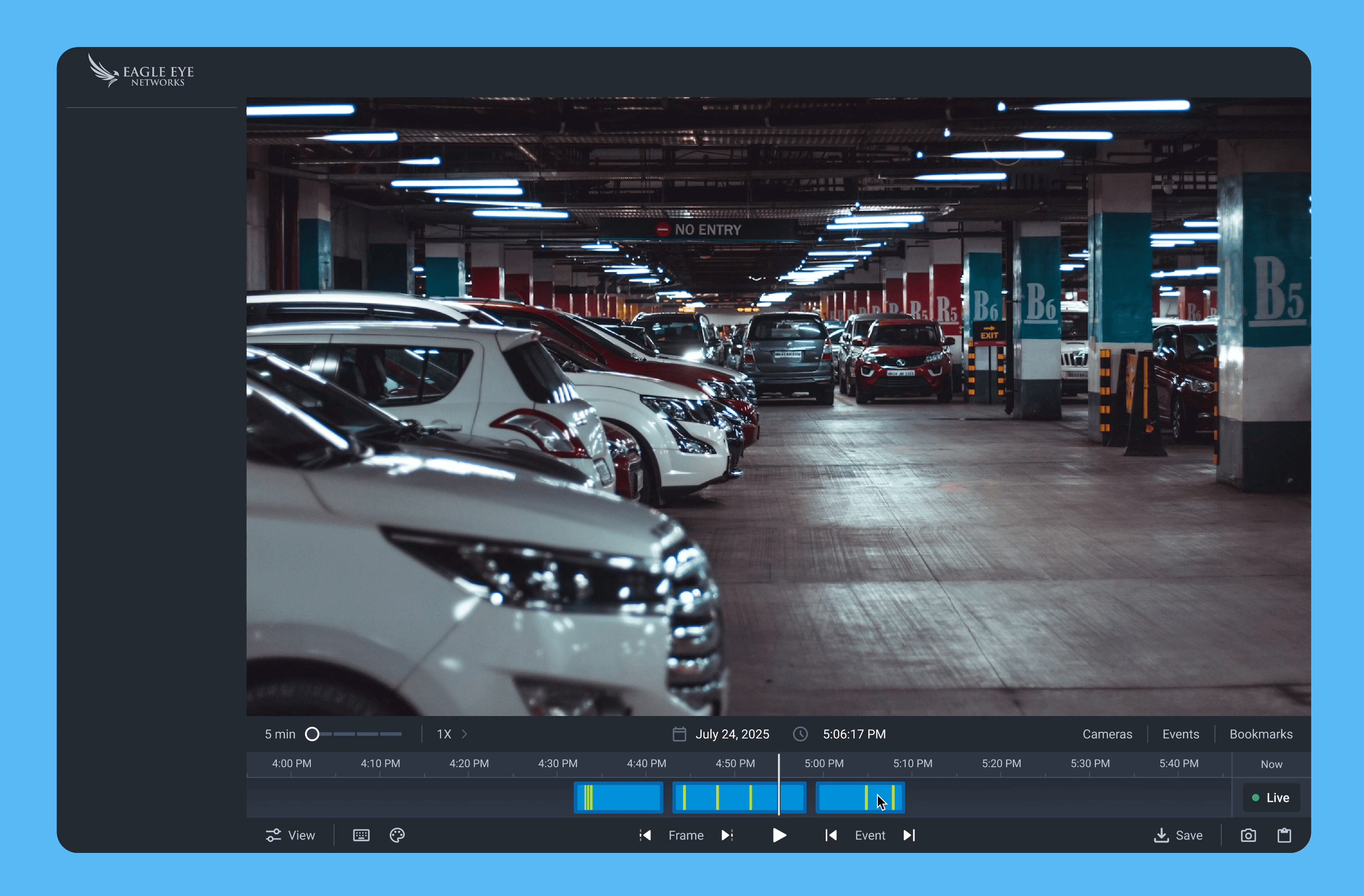
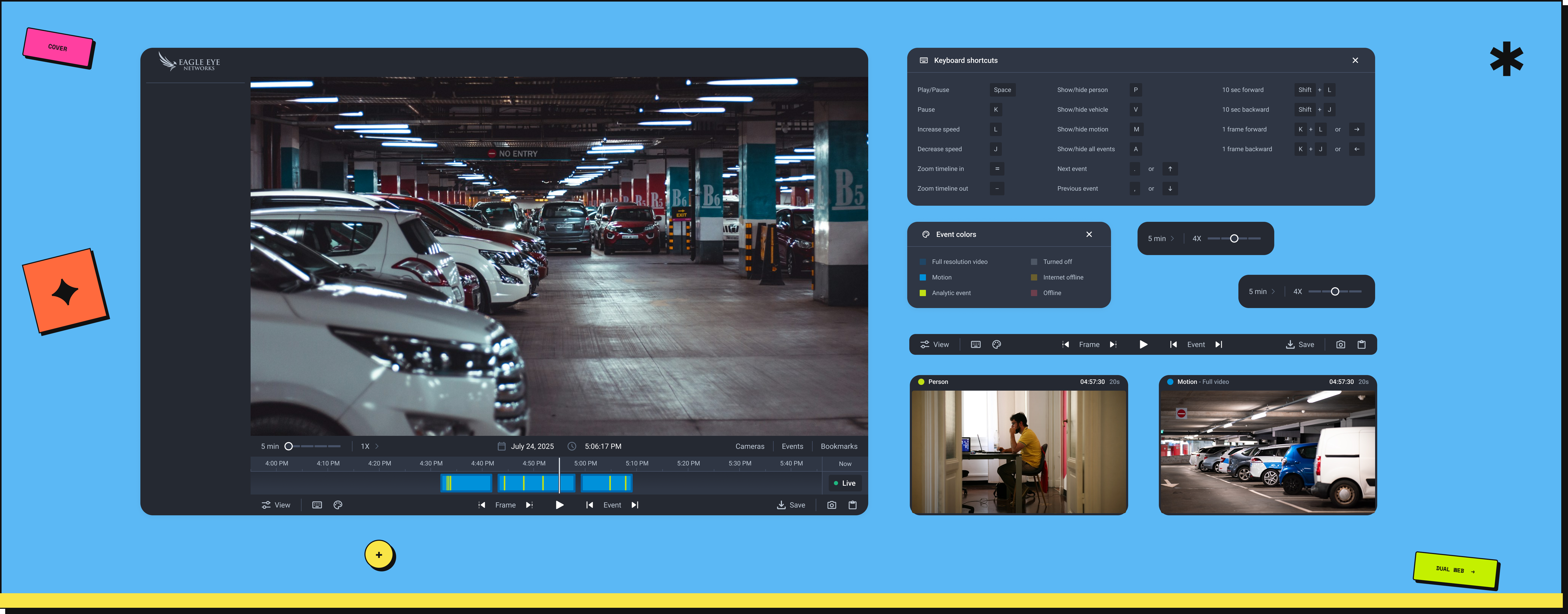
A slider replaced the icon buttons for a reason. With + and - controls, the only way to know your zoom level was to read the time gap in the timeline. The slider shows it directly - no guessing, no reading. The same component was reused for playback speed controls, keeping the interface consistent without adding new patterns.

Zoom & speed controls - redesigned
Design · Icon Buttons

Redesigning
Icon Buttons

  • Icons were placed within a 24px frame but actual graphics were often 12px or smaller - hard to see and difficult to tap, causing accessibility issues.
  • Users reported confusion with icons for jumping between events and frames. The meaning wasn't clear, slowing workflows and causing hesitation.
  • Increased the visual size of icons to improve visibility and redesigned unclear icons to make their function immediately intuitive.
Design · Preview Card

Event
Preview Card

To help users quickly scan events without interrupting their workflow, we introduced an event preview card. Hovering over any point on the timeline - without clicking - surfaces instant context about that moment.

  • A thumbnail image for quick visual reference.
  • Timestamp of the event.
  • A blue dot for motion events, a green dot for analytics-based events with event type label - so users understand what occurred without scrubbing.
Event preview card on hover
Design · Help Panels

Help Panels for
Guidance

  • The Color Help Panel gives users a clear reference for what each timeline color represents - camera statuses and event types - eliminating guesswork and enabling confident scanning.
  • The Keyboard Shortcut Panel provides a single, accessible reference for all available shortcuts - supporting power users who rely on them for faster workflows.
  • Together, these panels improve usability, discoverability, and confidence for both new and experienced users.
Color & shortcut help panels
Accessibility

Not an afterthought.

Accessibility was considered across every design decision, not added at the end. Icon touch targets were increased to meet minimum size guidelines. Event indicators were redesigned from thin strokes to larger blocks for better visibility. The timeline height was increased to improve interaction precision. Small changes individually - but together they made the experience usable for a much wider range of users.

4 Stakeholder Alignment

Refining the
Implementation Scope

During stakeholder reviews, we identified changes that could be implemented quickly while having significant impact on reducing drop-off. Collaborating closely with stakeholders, we prioritised high-value, low-effort improvements - changes that would deliver maximum benefit without requiring extensive development time.

We then organised these changes into a structured plan with multiple iterations, allowing us to deliver improvements gradually, gather feedback, and continuously refine the experience while ensuring early wins for users.

5 Technical Feasibility

Validating
Feasibility

When the designs were presented to the development team, it became clear that modifying the existing component would be limiting. The team recommended creating a new, independent component instead - customisable and easier to maintain, allowing future features to be added without impacting other parts of the system.

Validating technical feasibility early ensured the redesign would improve the current experience and support future enhancements efficiently.

6 Measuring Impact

The numbers
spoke clearly.

Adoption was tracked via PostHog across a phased rollout - first to select clusters, then to all users. The metric that mattered: were users staying in the new app, or reverting to the legacy system?

📉
Before redesign - 70%+ drop-off Over 70% of users opened the new web app and immediately switched back to the legacy system. The friction was real and measurable via PostHog.
📈
April cluster rollout - 54% adoption Released to select clusters first. Adoption reached 54% with drop-off rates falling to near zero - early signal the redesign was working.
🚀
May full rollout - 99%+ adoption Released to all clusters. Adoption crossed 99%. Users stopped going back - the legacy system is now being retired entirely.

The legacy app is being sunset. When users stop going back, that's not just a metric - it's validation that the redesign solved the right problem.

Worth noting: retiring the legacy system wasn't a product or design initiative. It came from engineering. The 99%+ adoption rate is what finally made it possible. Maintaining two parallel systems has real costs: split engineering focus, dual infrastructure, and a support team stretched across two products. The redesign didn't just improve the user experience. It cleared the path for a long-overdue business decision.

Reflections

What I learned.

🔍
Scoping complexity is a skill in itself. The timeline component was estimated, scoped, and planned. It still took six months instead of one. The complexity wasn't missed. It was hidden. What looked like a straightforward modification revealed itself during implementation to be a full rebuild. Some problems only show their true depth once you start building. The lesson: for technically complex components, a lightweight engineering spike early on can surface what scoping alone cannot.
01
🎯
Design value and product value aren't always the same thing. Partway through, a clear gap emerged between what the design team believed would add the most value and what the product team was prioritising. That misalignment wasn't anyone's fault. It reflected different vantage points on the same problem. What it taught me was to bring product thinking into design reviews earlier, not just design critique.
02
📊
Data doesn't always win, and sometimes that's right. A feature with less than 0.1% usage was on the table for removal. The numbers were clear. But the product team held back, concerned about edge-case risk in a B2B context where even rare workflows can matter significantly to specific customers. I learned that in complex enterprise products, low usage isn't always sufficient justification to remove something. Sometimes the right call is to keep it, document why, and revisit with more evidence.
03
You're done here
Back to all work →
← All case studies Start a project →