Device
Selection
Unifying camera organisation across thousands of sites - from fragmented name-recall to a scalable, hierarchy-driven selection system.
Unifying camera organisation across thousands of sites - from fragmented name-recall to a scalable, hierarchy-driven selection system.
A cloud-based smart video surveillance platform serving multiple industries worldwide. As camera networks scaled into the tens of thousands, the existing system forced users to navigate by memory alone - no grouping, no hierarchy. This case study is about building the structure they never had.
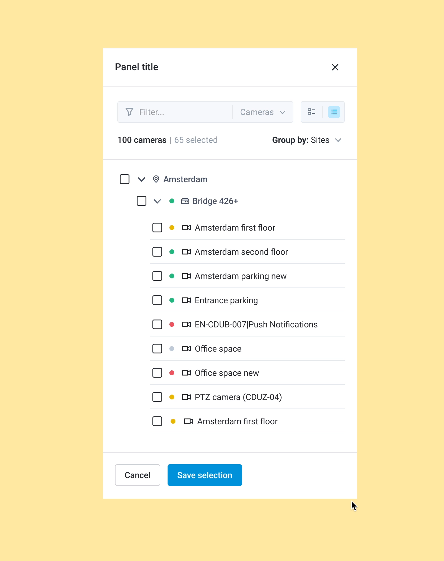
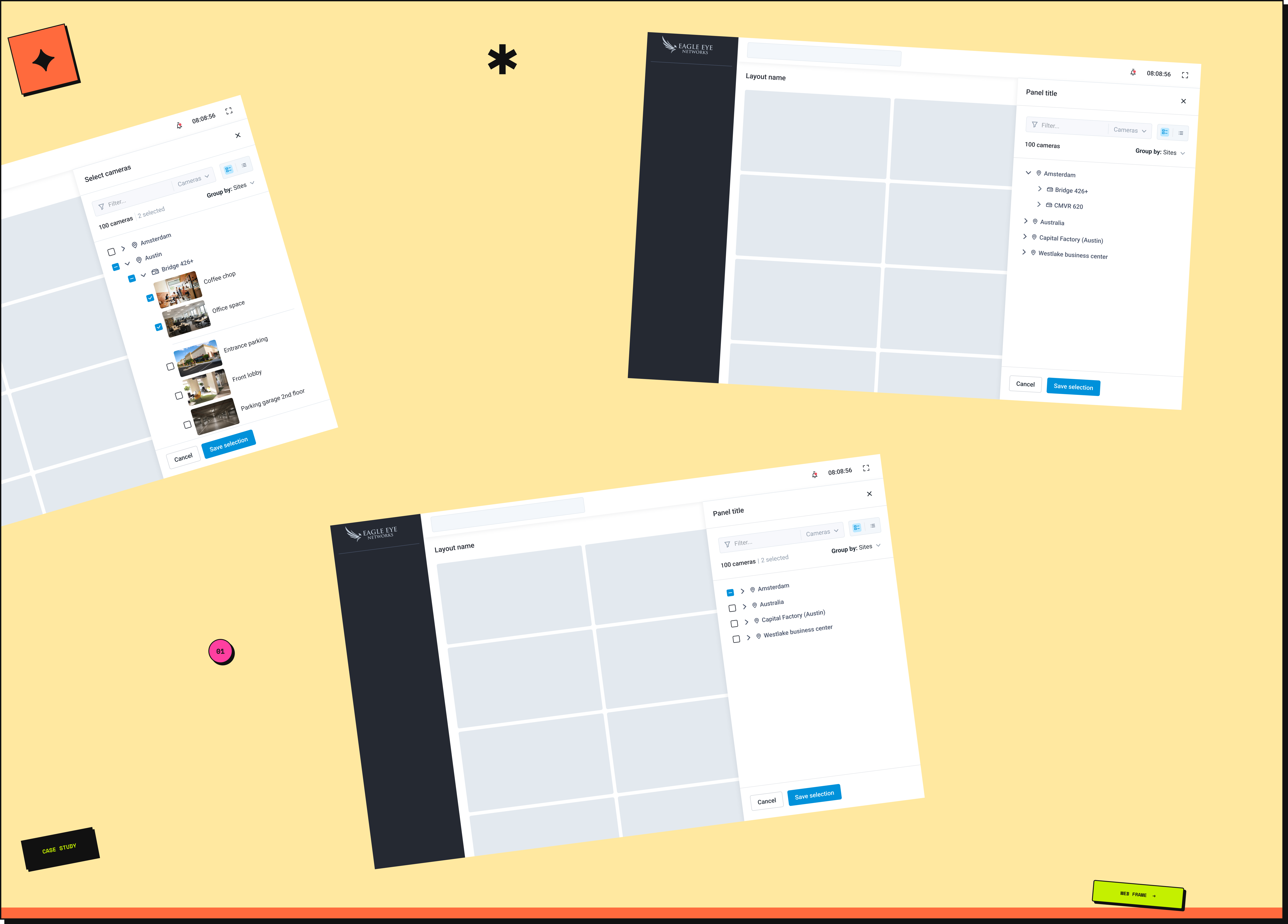
The platform had no way to group devices. No sites, no layouts, no bridges - just a flat list of cameras, navigable by name alone.
In a small deployment that's manageable. In a large one it breaks entirely. A global fashion retailer with thousands of stores worldwide had cameras named "Store_204_Floor1_Cam12" and "Paris_Entrance_Cam3" - and the only way to find the right one was to remember its exact name.
Large accounts could have multiple sites, each with bridges, switches, sensors, and cameras nested underneath. Finding a specific device meant knowing where it sat in a physical hierarchy the app had no way to represent. At that scale, memory isn't a strategy.
We analysed the key considerations for designing a scalable camera organisation system across platforms - one that could serve everything from a small single-site deployment to a global enterprise network.
The list was narrowed through PM input and technical feasibility checks - ruling out structures that couldn't be supported by the API or didn't reflect how users actually described their camera networks.
Working closely with PMs, we consolidated insights from user summits and customer support feedback. The picture was consistent across account sizes - device selection was hard, and it got harder as accounts grew.
Support feedback confirmed what usage data suggested - users were spending significant time locating cameras, and in time-sensitive situations like live monitoring or incident response, that friction had real consequences.
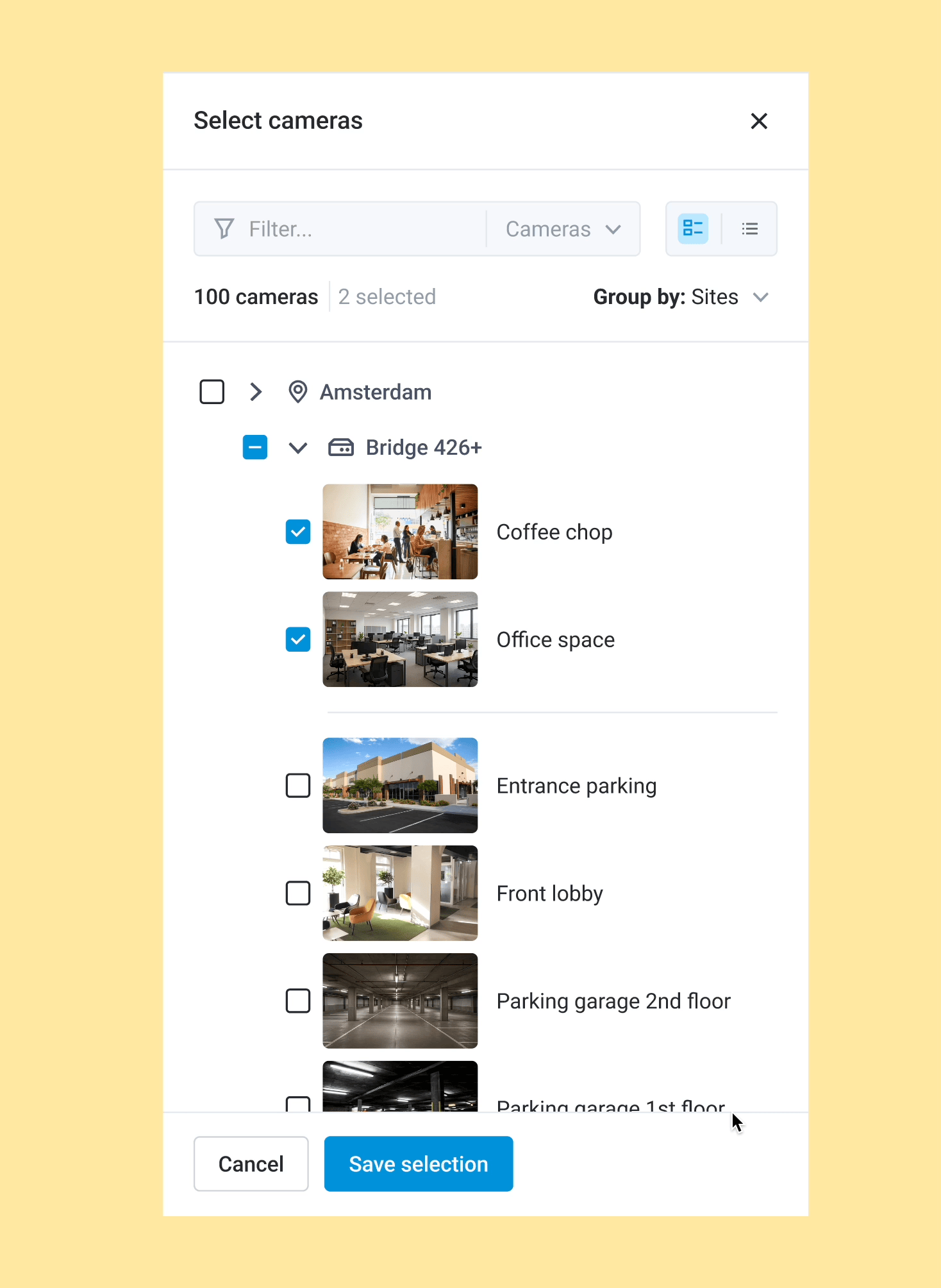
We introduced two viewing options so users can choose the display density that fits their workflow and account size.
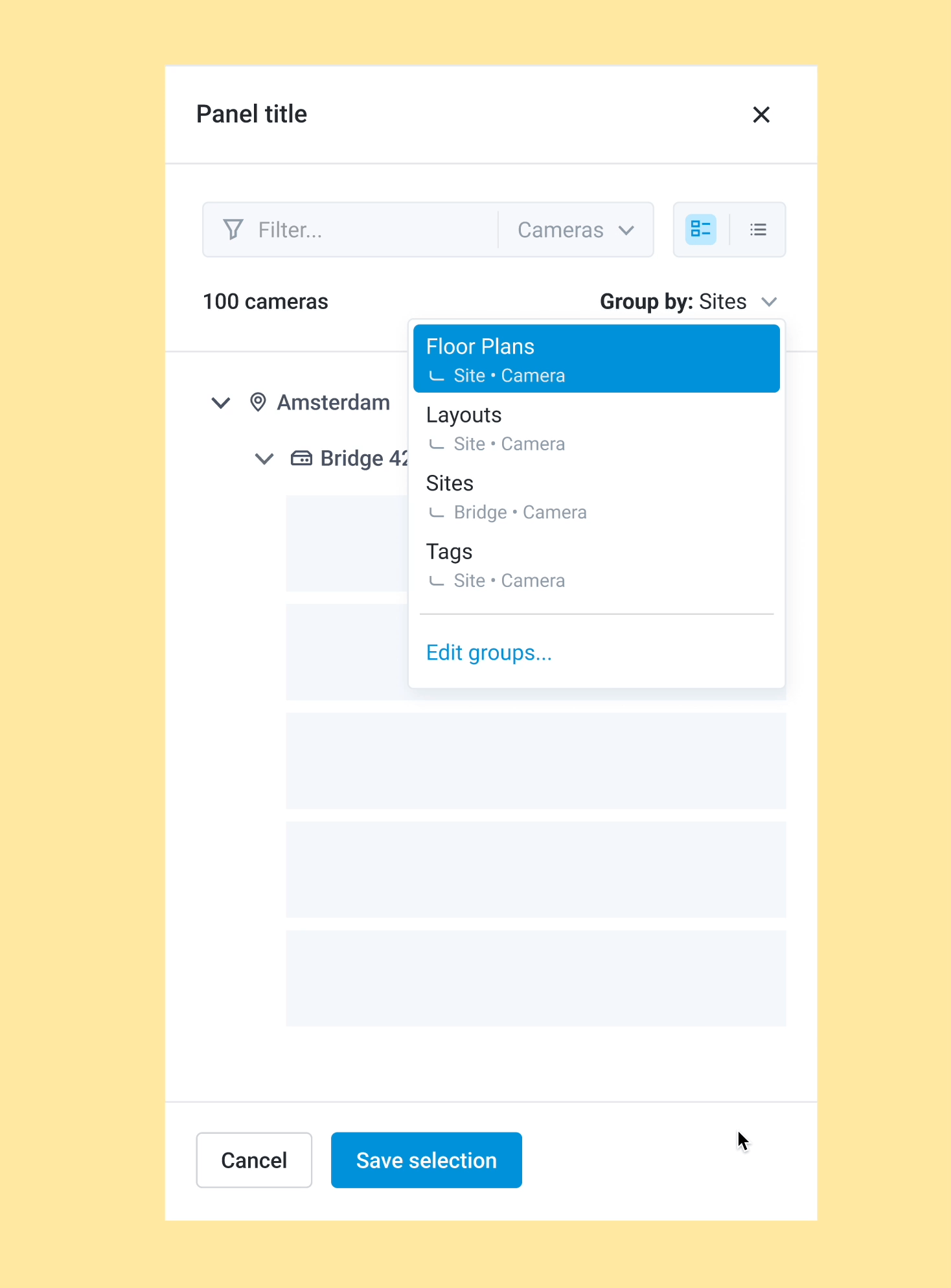
The user can adjust the hierarchy in which they want to view devices using a "Group By" dropdown component. The default hierarchy adapts based on account size:
By dynamically adjusting the hierarchy, users see only relevant information, making navigation faster and easier.
One of the hierarchy options we explored was ordering by resolution - giving users the ability to group cameras by quality level. Without user data to validate whether this was a meaningful way to navigate, we couldn't be confident it would add value over location-based grouping. Kept it out of the first release - if usage data signals demand for it, it's straightforward to add.
Users configure their preferred navigation order - some prefer Site → Bridge → Camera for full context; others prefer a flatter Camera → Site view for speed. The "Group By" dropdown adapts to their workflow.
The default hierarchy is set dynamically based on account scale - small single-bridge accounts see a simplified view, while large multi-site accounts see the full nested structure. Users can also save their configuration so it persists between sessions.
During stakeholder reviews, it became clear that several advanced grouping and filtering options couldn't make it into the first iteration - timeline and API limitations made them unfeasible. Grouping by analytics running on device, manufacturer, or device status were all removed from the initial release.
None of it was dropped - everything was documented as future opportunities, keeping the intent alive for the next sprint.
Scoping decisions aren't failures - they're how you ship something real while preserving what comes next.
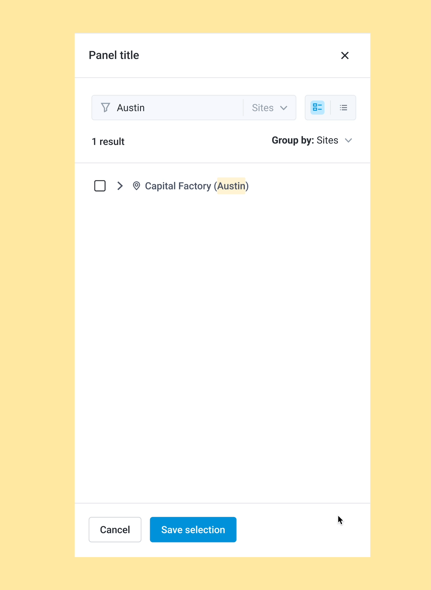
The initial search concept aimed to query across all hierarchy levels simultaneously. Due to API limitations, a unified cross-hierarchy search was not feasible at this stage.
We redesigned the interaction: users first select the hierarchy level from a filter dropdown - Site, Bridge, or Camera - and the text search applies only within that selected category. This maintained efficient search functionality within the system's real constraints.
The feature is live. PostHog analytics are set up and tracking. It is still early days, but these are the signals we are watching: view preference usage (how often users switch between card and list views), hierarchy navigation patterns (which hierarchy levels users interact with most across account types), and camera selection time (how long it takes users to locate and select a camera after the redesign). We plan to review and update this section with findings in Q3 2026.
Scope boundaries need to come before high-fidelity design, not after. Customisable hierarchy order was designed and ready. It got cut from the first release because the timeline didn't allow for full implementation. That decision was right, but it came late. I'd spent significant design time on a feature that didn't ship. If I started this project again, I'd push harder to define what is in and what is out before opening Figma.
Designing for scale meant designing for all devices at once. The hardest part wasn't the hierarchy logic itself. It was making the same system work consistently across web, Android, and iOS without it breaking down on any platform. What felt natural on web needed rethinking for mobile interaction patterns. Keeping the experience coherent while respecting platform conventions took more iteration than expected.
Cut features should be documented, not dropped. Several features from this project didn't make the first release: grouping by analytics, manufacturer or device status, and cross-hierarchy search. None of it was wasted. What I learned was to document each cut explicitly: why it was removed, what would need to be true for it to come back. That way nothing gets lost. It just gets deferred.