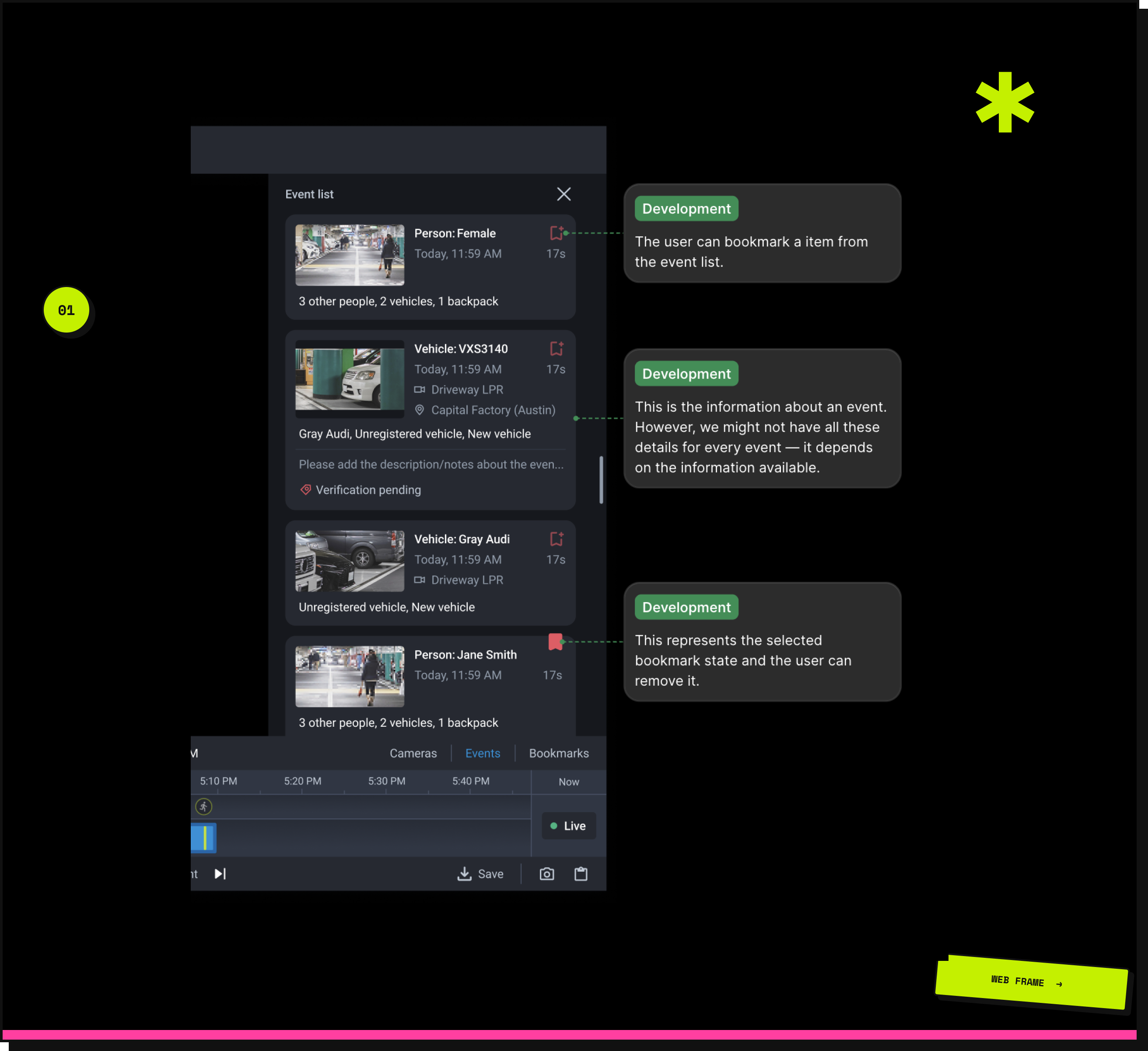
Events
Redesigning how security teams discover, extract, and share critical footage - from fragmented scrubbing to instant, actionable access.
Redesigning how security teams discover, extract, and share critical footage - from fragmented scrubbing to instant, actionable access.
A cloud-based smart video surveillance platform serving multiple industries worldwide. Users rely on it to manage their business from anywhere - but reviewing past events meant manually scrubbing timelines, one point at a time. This case study is about changing that.
The new web app introduced event filtering - something the legacy system never had. But NPS feedback kept pointing the other way: the legacy still felt more intuitive.
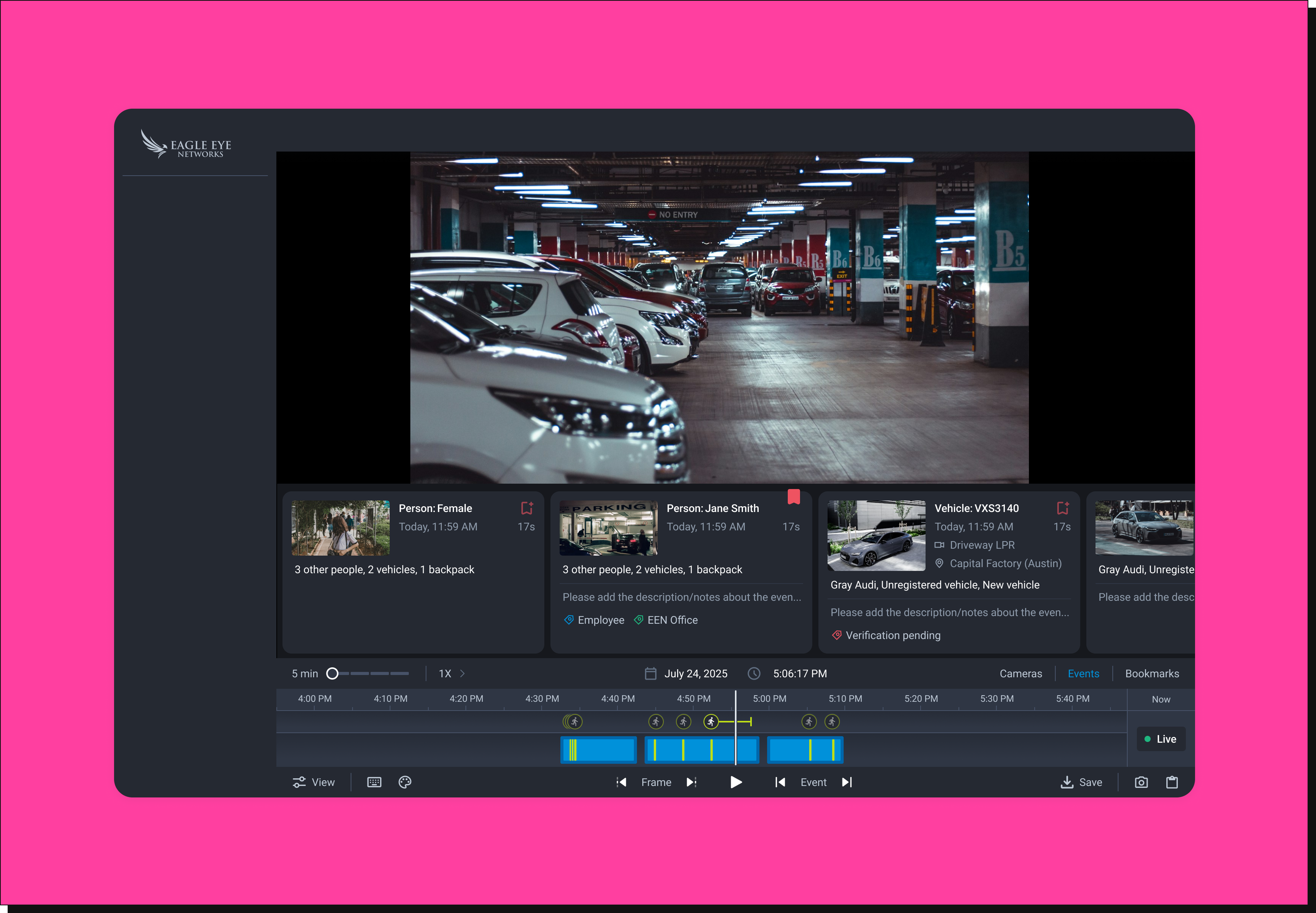
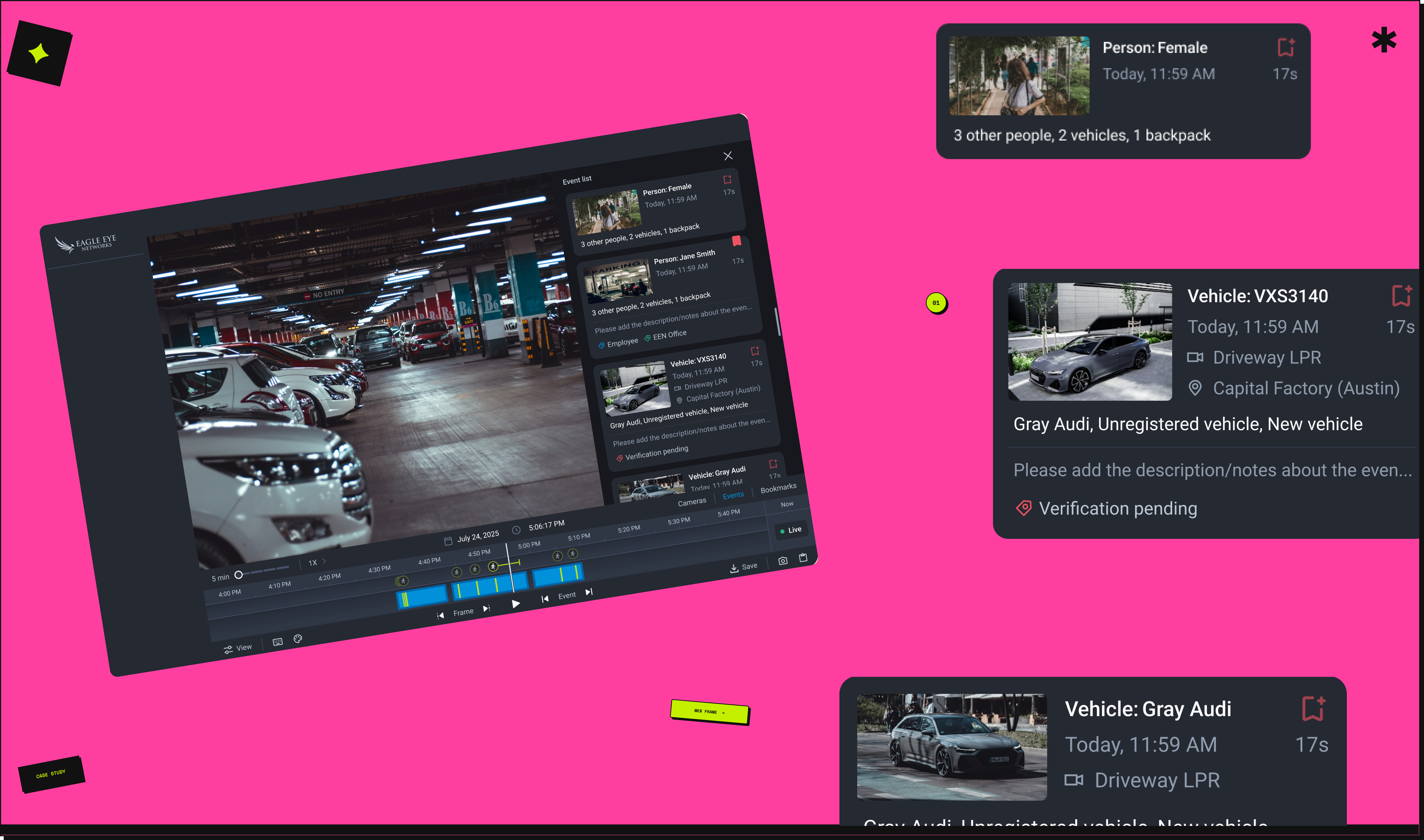
Using the product ourselves, we saw why. Moving between events meant clicking a single icon button - one at a time, no overview, no context. In accounts with hundreds of daily events, finding a specific moment meant picking a date, scrubbing the timeline, hovering over markers, and repeating. No summary. No way to see what happened at a glance.
Finding the clip was only half the problem. Exporting it meant a timeline selection, an export menu, multiple configuration steps - repeated separately for every single event. What should have taken seconds routinely took several minutes - and in a security incident, that time gap matters.
Events shown as point markers - no aggregation or grouping
No high-level overview or time-period summary
No quick way to extract or share clips
Every review requires manual hover-and-scrub
The stakes varied by industry - but the friction was consistent. A security team responding to an incident needed to find a person, extract a clip, and share it with authorities in minutes. A retail operations manager needed to cross-reference a POS event against camera footage to investigate a billing discrepancy across hundreds of cash registers. A fleet manager needed to flag an unrecognised vehicle and build a record. In every scenario, the workflow slowed them down at the moment it mattered most.
For a customer managing over 10,000 cameras - from POS cash registers to security incidents - this wasn't a minor inconvenience. Every step added time they didn't have.
This wasn't a top-down feature request - it was a design-led initiative, driven by identifying gaps in the experience and an opportunity to create stronger business impact beyond the existing product roadmap.
The new web app had capabilities the legacy never did - including event filtering. But NPS feedback kept surfacing the same sentiment: the legacy felt more intuitive. We used the product ourselves to understand why. The filtering existed, but there was no way to see all events together, act on them quickly, or share them without a lengthy export process. That gap became the brief we wrote for ourselves.
No formal brief - the problem was self-identified. Making the case for why this was worth building was part of the work.
I created low-fidelity wireframes to define interaction patterns and establish a clear, scalable information hierarchy. The goal at this stage wasn't visual polish - it was validating the end-to-end flow, identifying key information requirements, and testing whether the proposed structure meaningfully supported user goals.
Wireframing early also surfaced constraints we hadn't anticipated - helping us align with engineering before any high-fidelity work began.
Through iterative design exploration, we narrowed down to two promising solutions. Both shared similar underlying insights about event access - but differed in how events were structured spatially. To make an informed decision, we conducted internal A/B testing before rolling out to users.
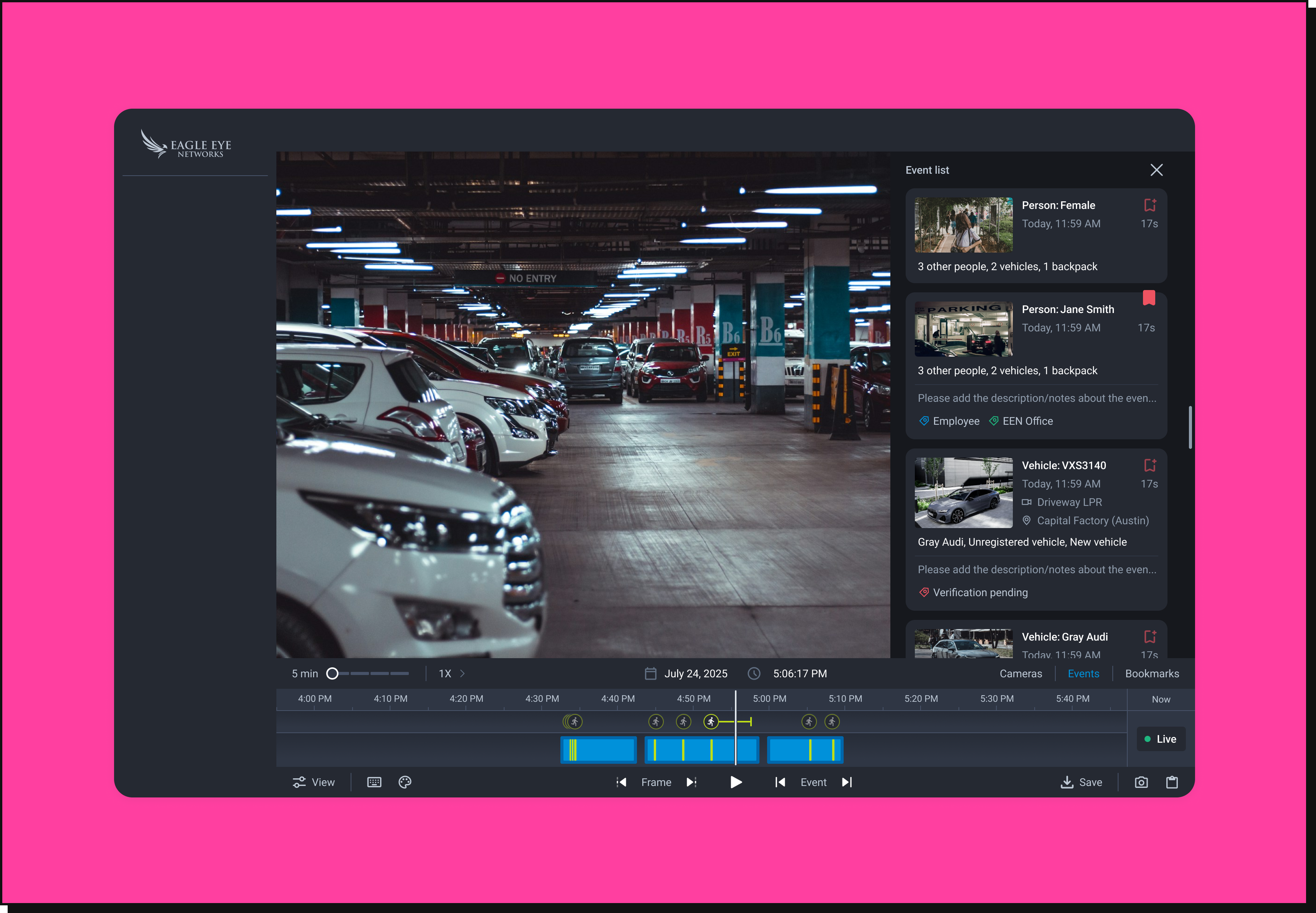
Leveraged users' existing mental models of horizontally scrollable content. Preserved more screen space for the video player - but introduced a spatial disconnect between the event list and the timeline.
Aligned closely with the timeline, keeping events and their corresponding moments in proximity. Improved contextual mapping and made navigation more intuitive - at the cost of some vertical video space.
of participants preferred the vertical event list - consistently highlighting that vertical scrolling feels more natural and aligns with familiar interaction patterns. Tested internally with a cross-functional group of around 10 participants across leadership and product teams. Users also emphasised that video clarity should never be sacrificed for event accessibility.
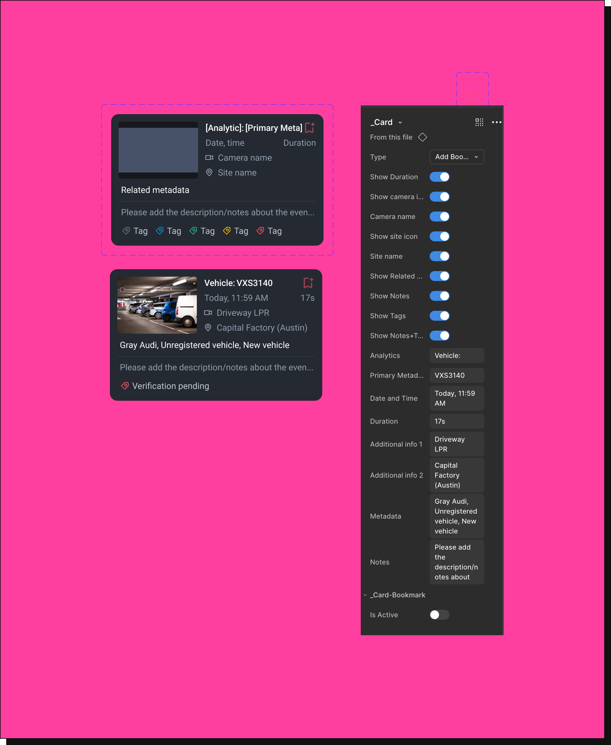
As part of future planning, we identified an opportunity to reuse the event card across multiple areas of the product - bookmarks, incident management, and face match workflows. We designed it as a flexible, reusable component that adapts to different use cases while maintaining consistency.
By structuring this as a reusable component, we ensured consistency across the product while making it easier to extend for future features.
Based on the A/B evaluation, the team aligned on the vertical event list as the preferred direction - balancing contextual clarity with user needs. We presented this to business stakeholders and cross-functional teams, clearly articulating the rationale and trade-offs, and secured alignment to move forward.
For the handoff, we leveraged detailed Figma annotations and clear labeling to ensure precise communication across cross-functional teams. Centralizing specifications, interactions, and discussions in a single source of truth streamlined collaboration and reduced ambiguity during implementation.
The design is complete and implementation-ready. Engineering bandwidth is currently focused on performance - this is next in the queue.
When it ships, these are the signals we'll track:
Design can find opportunities the roadmap hasn't named yet. Framing them in terms of user friction and business value is what turns an observation into influence.
Structured evaluation over intuition - internal A/B testing grounded our decision in user preference, making the final choice defensible and data-backed.
Every layout decision carries trade-offs. The tension between spatial efficiency, usability, and familiarity shaped the entire design direction.
Reusable components aren't just an engineering concern - designing for reuse upfront reduces inconsistency and accelerates future feature development.